MTX Finance – a complete brand and digital ecosystem
Logo redesign, brand architecture, brandbooks for MTX Finance, POS and Capital, a new fintech website and B2B LinkedIn communication.
NewEra built MTX’s complete visual and digital system: a logo redesign, shared brand architecture for MTX Finance, MTX POS and MTX Capital, brandbooks, a new MTX Finance website and LinkedIn strategy for an international B2B audience.
One brand. Three directions. One consistent identity.
NewEra built MTX’s complete visual and digital system: a logo redesign, shared brand architecture for MTX Finance, MTX POS and MTX Capital, brandbooks, a new MTX Finance website and LinkedIn strategy for an international B2B audience.
Our work with MTX went far beyond creating a new website. We built a complete visual and digital system that unites MTX Finance, MTX POS and MTX Capital under one recognisable identity while giving each direction its own character.
We redesigned the logo, developed detailed brand guidelines for all three product lines, created the new MTX Finance website and built a LinkedIn communication system for an international B2B audience.
- Logo Redesign
- Brand Architecture
- Brandbooks for all three brands
- Web Design & Development
- UX & Content Structure
- LinkedIn Strategy
- Social Content & Design
How do you present complex financial infrastructure simply and confidently?
MTX operates in an environment where trust, clarity and professional presentation are critical. Its products combine traditional currencies, international payments, multi-currency accounts, FX, stablecoins, on/off-ramp solutions and different payment systems.
The complex financial infrastructure had to become easy to understand, while MTX needed to look like one company — whether a client was dealing with Finance, POS or Capital.
- Trust
- Technology
- Movement
- Precision
- Scale
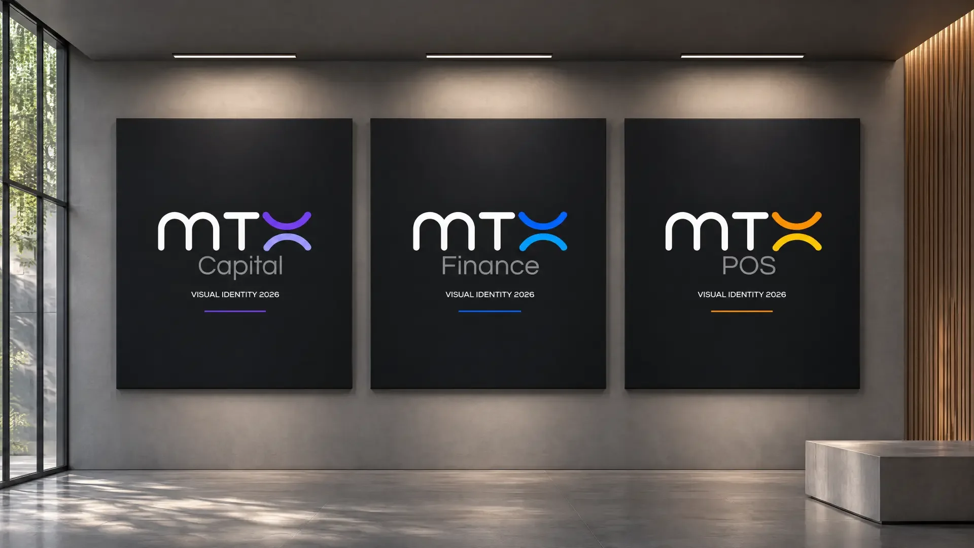
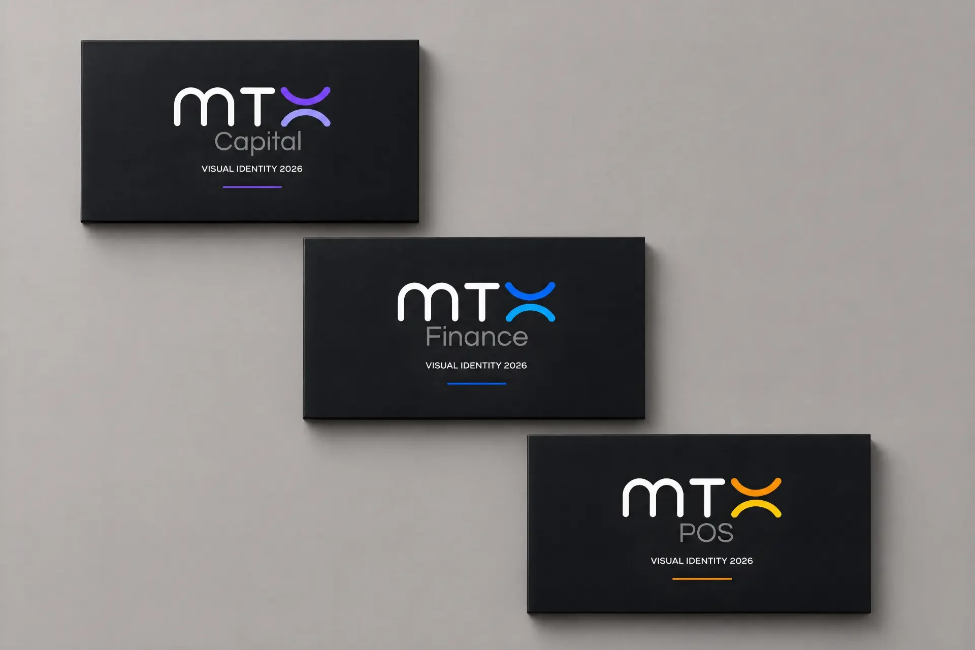
One DNA. Three distinct characters.
Instead of creating three visually disconnected brands, we built one shared system. MTX remains the recognisable core, while the product lines share a common logic for logo, typography, composition, iconography and communication.
MTX Finance — Movement, security and global financial flows.
The blue visual code creates a technological, institutional feel and focuses on international payments and financial infrastructure.
MTX POS — Speed and action.
A more energetic visual language highlights instant payment, easy interaction and everyday use.
MTX Capital — Capital, analysis and risk management.
A more measured, premium direction retains MTX as its foundation while creating its own sense of precision and strategic thinking.
We preserved recognition. Then built a system around it.
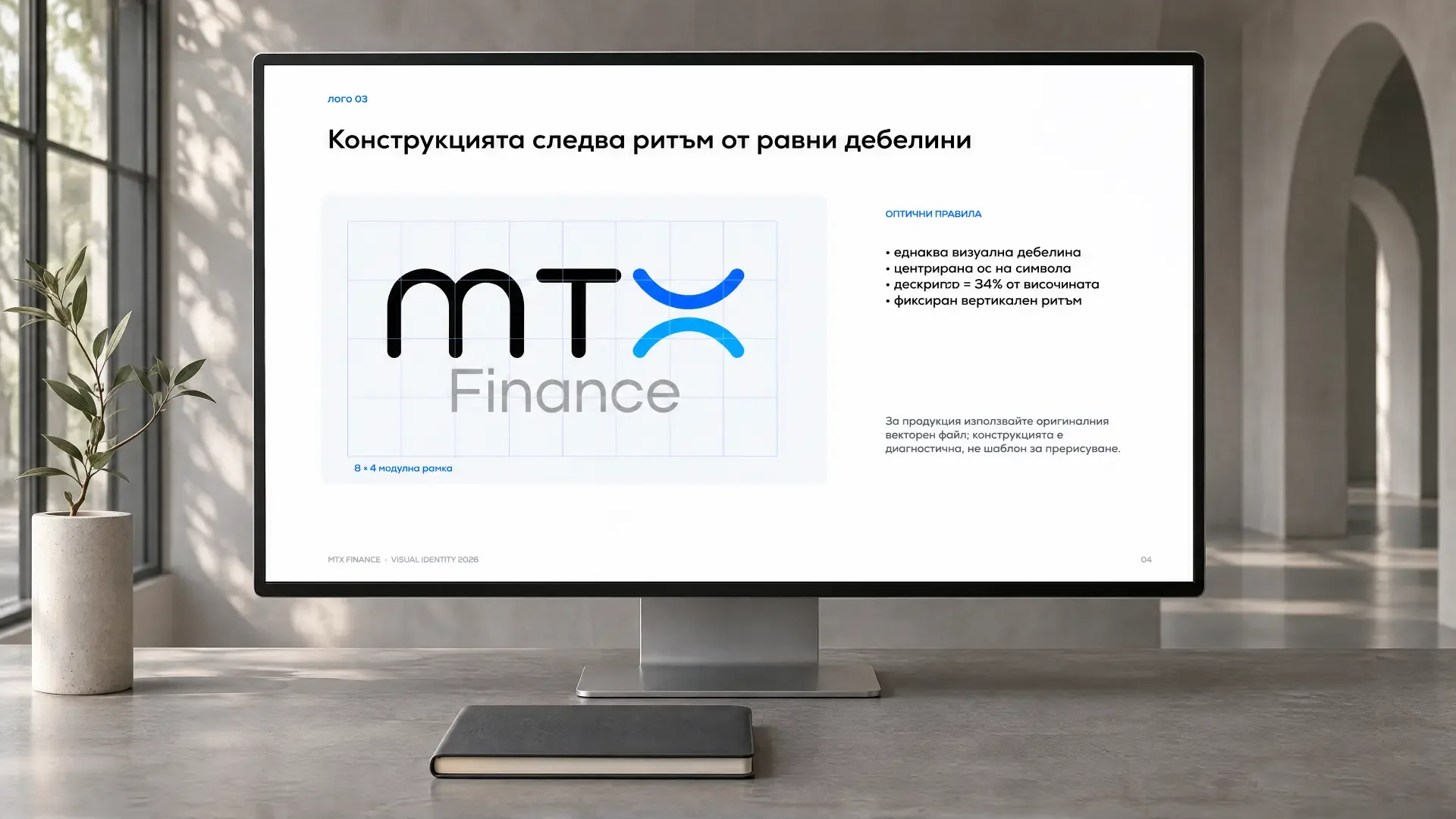
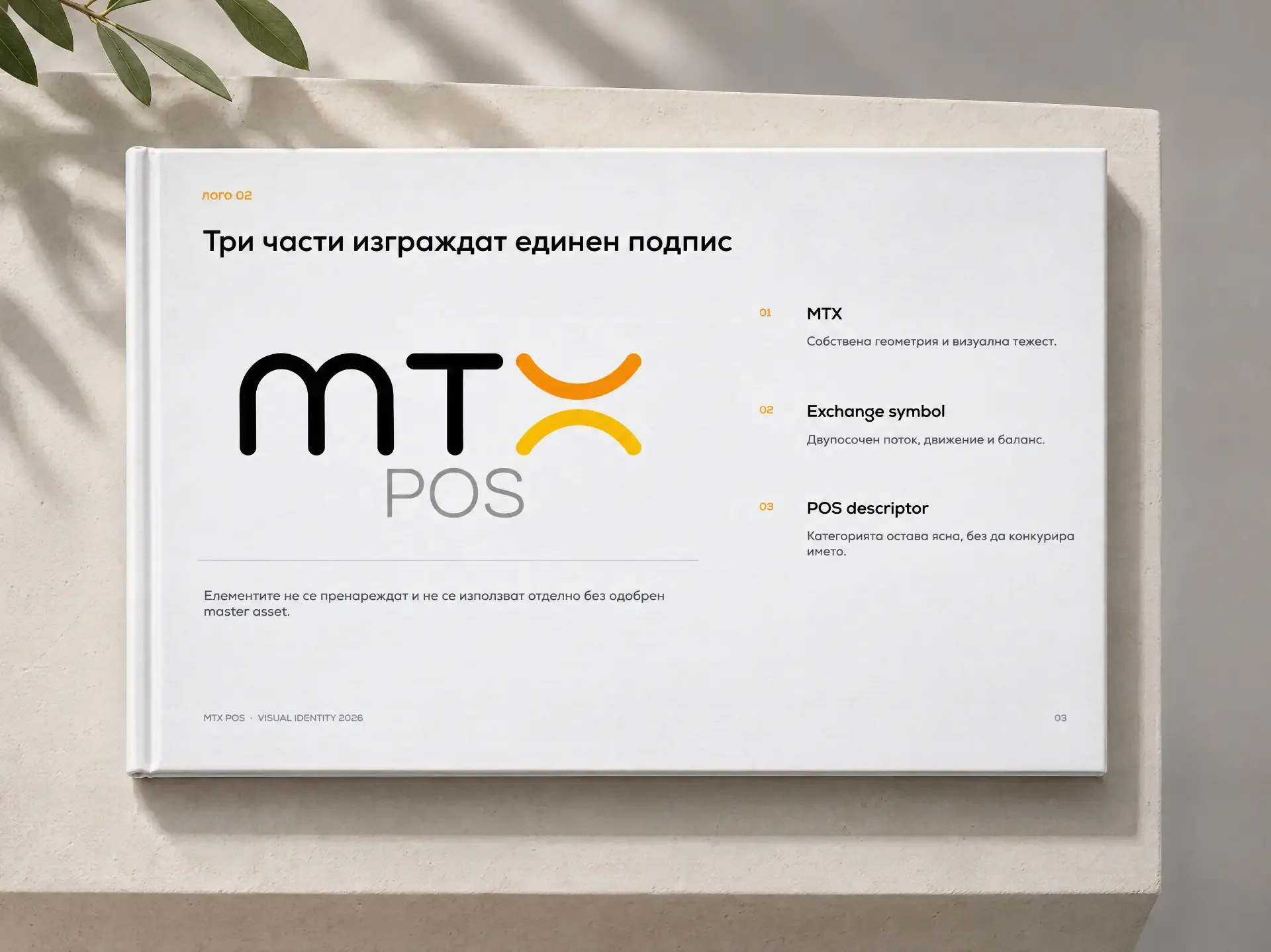
The logo redesign was the starting point for the entire identity. We refined the visual language and created a structure that allows the logo to work consistently across every product line.
The logo is no longer a standalone mark, but a system that can grow with the business.
- MTX as the recognisable name
- The exchange symbol representing two-way flow, movement and exchange
- The product descriptor — Finance, POS or Capital
A brand is more than a logo.
For each of the three directions, we developed a detailed rule system defining how MTX should look at every touchpoint.
The goal was an identity that does not depend on a specific designer or campaign, but works consistently across web, social media, product interfaces, presentations and future communication materials.
- Logo and versions
- Spacing and sizes
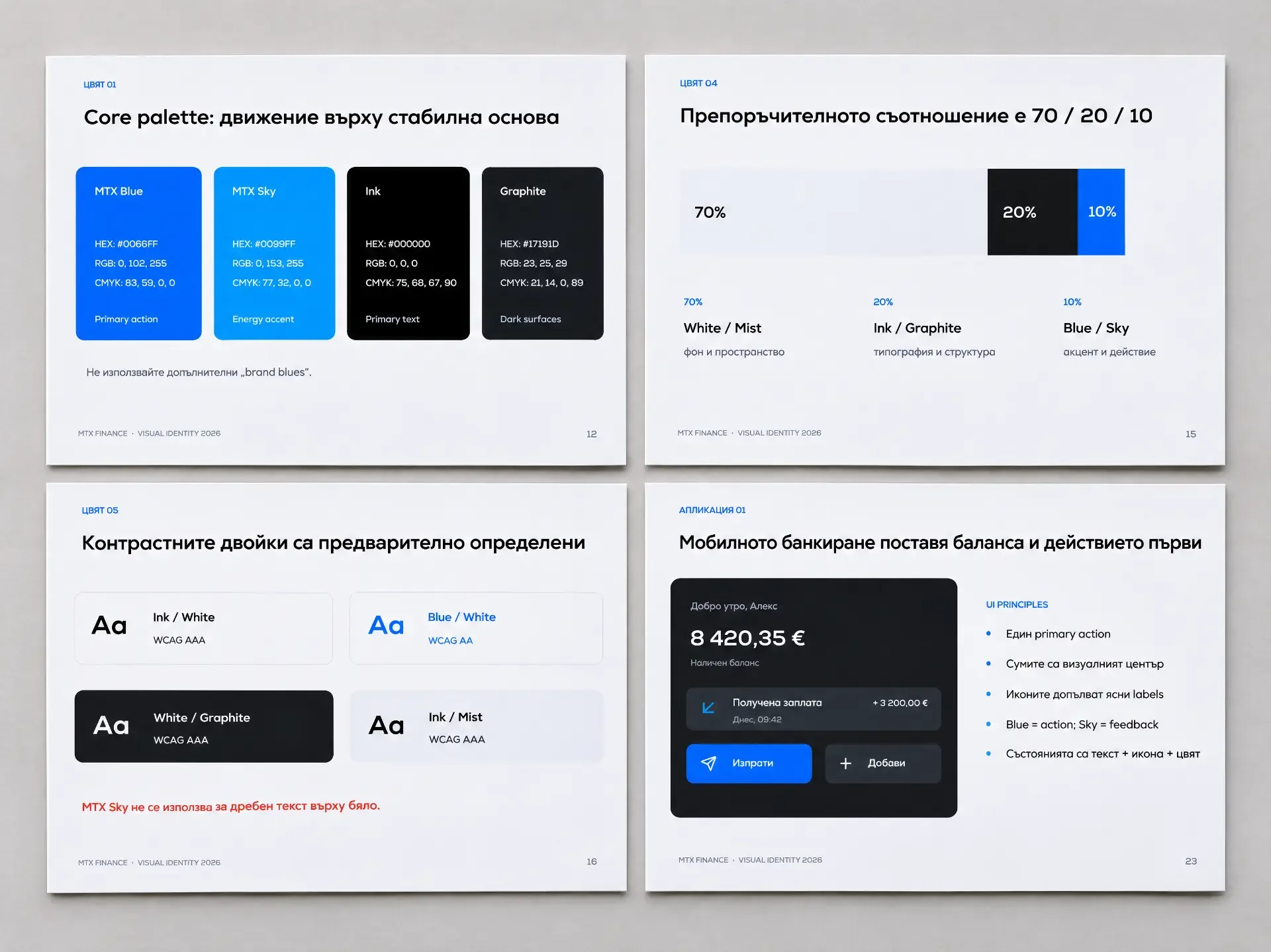
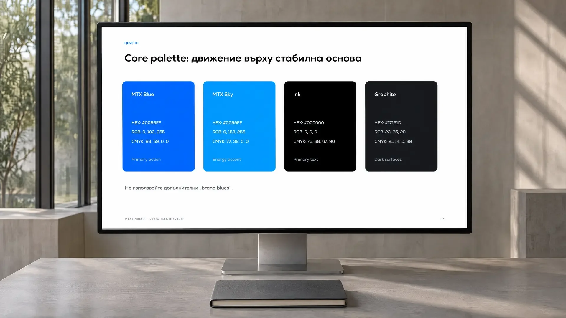
- Colour system
- Typographic hierarchy
- Iconographic style
- UI principles
- Functional colours
- Co-branding rules
- Digital applications
- Sub-brand consistency
Financial infrastructure presented as a product of the future.
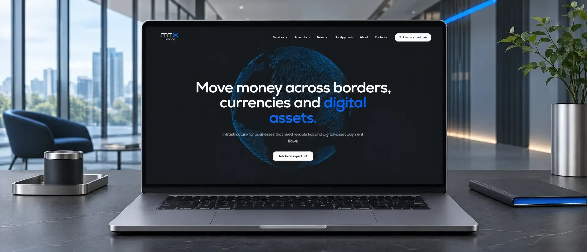
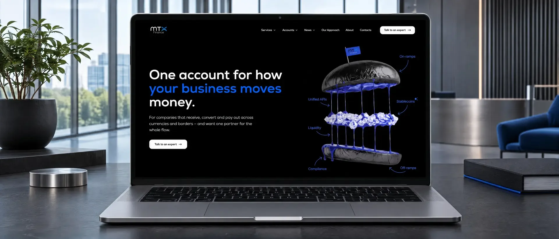
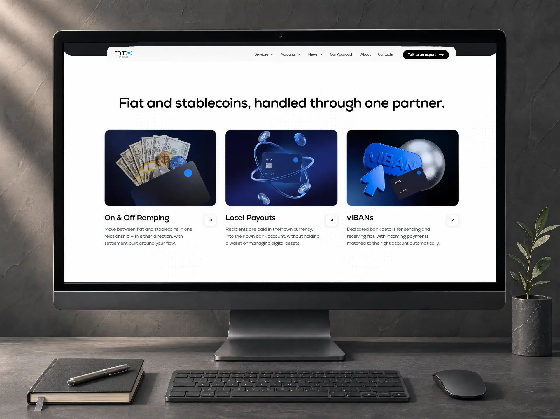
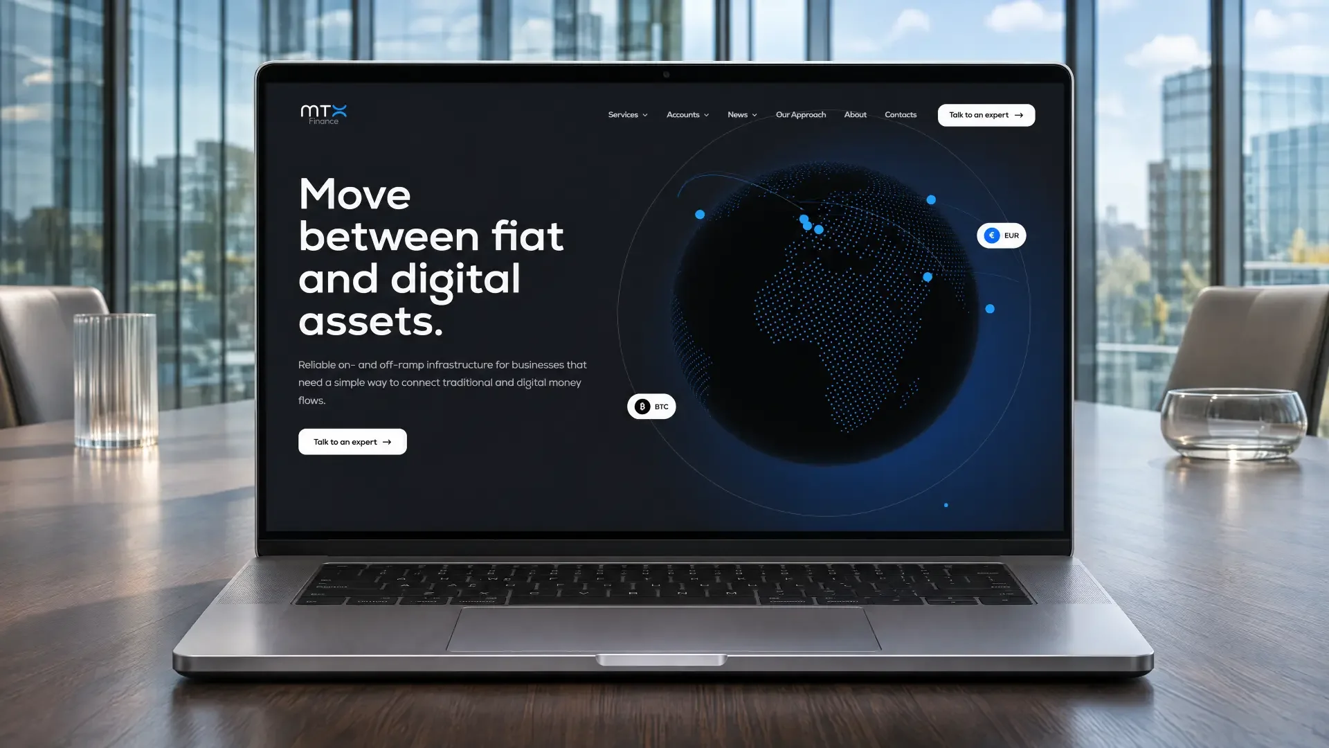
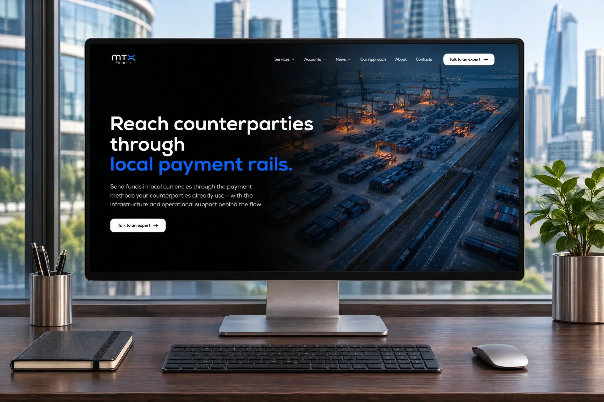
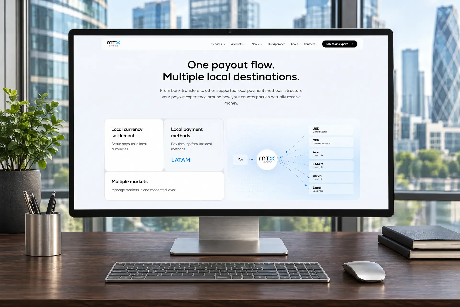
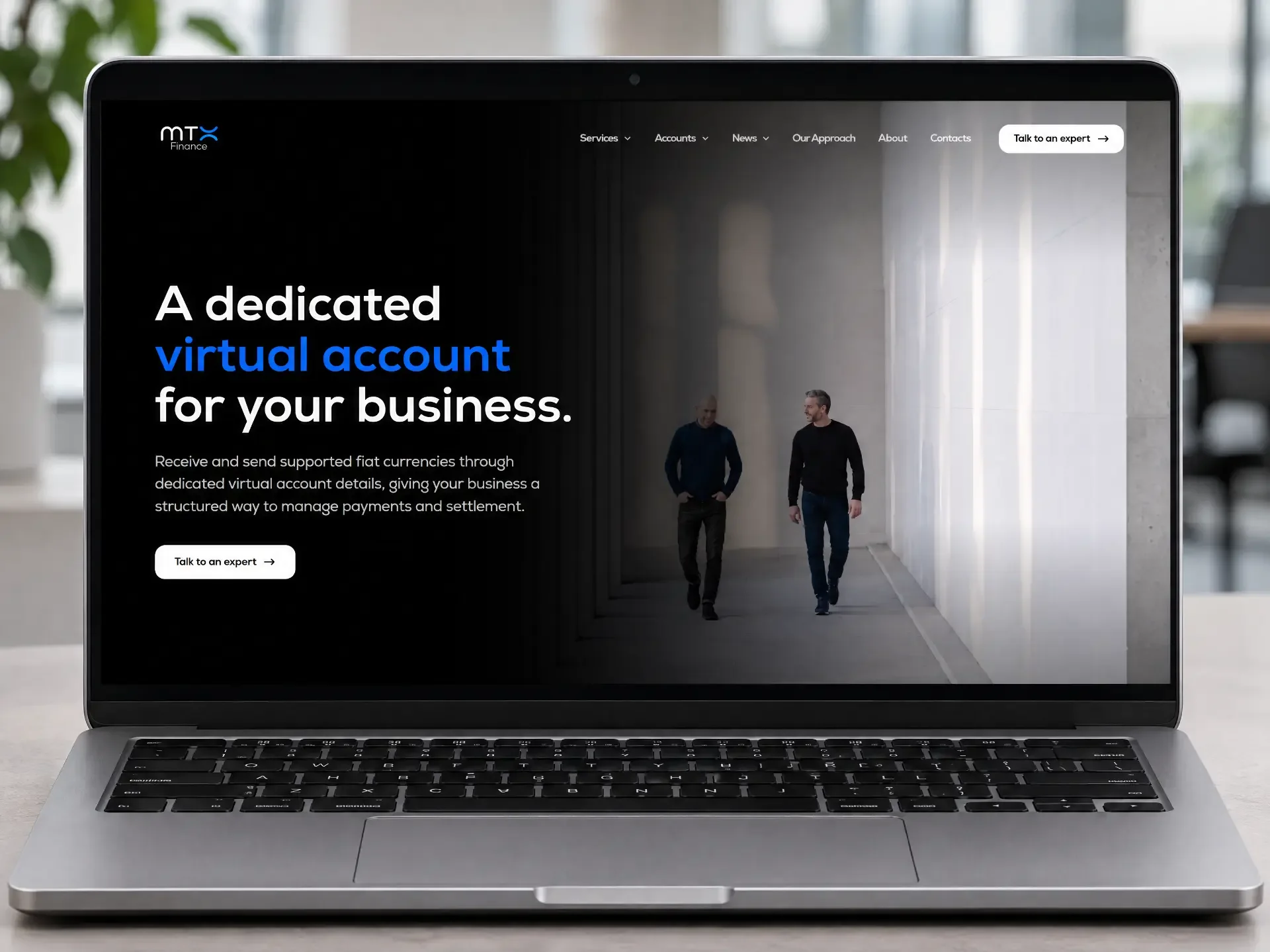
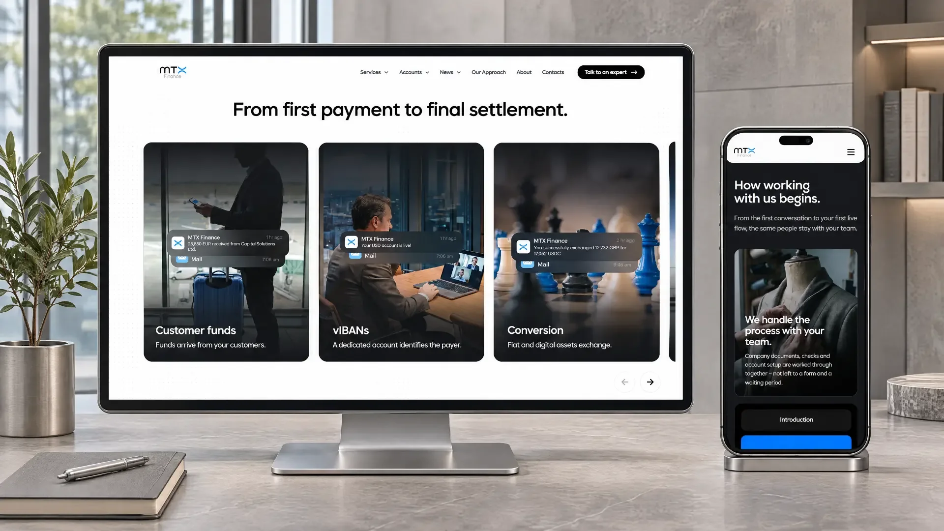
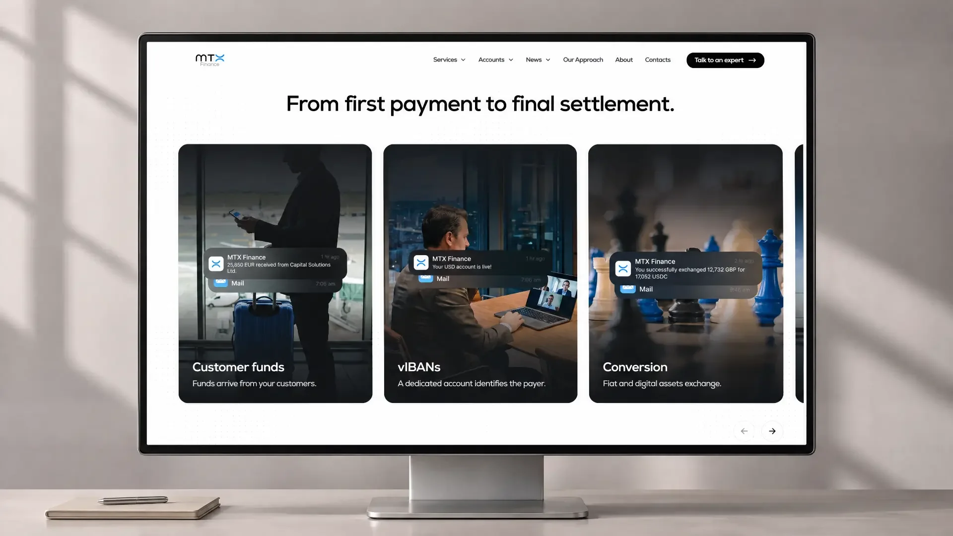
For MTX Finance, we created an entirely new digital experience — a modern product website with the feel of a global fintech platform rather than a traditional corporate website.
The website presents MTX as one financial infrastructure for internationally operating companies and shows how its individual services work together.
- Multi-currency accounts
- Pay-ins & Payouts
- FX
- OTC
- Stablecoins
- Crypto on/off-ramp
Complex technology. An easy experience.
The biggest UX challenge was explaining complex financial processes without turning the website into documentation. We built the communication around visual flows, clear product blocks and concise messages.
Users do not need to understand the infrastructure behind every transaction. They need to understand what they can do with it.
Financial confidence without conservative bank design.
We removed the financial industry’s familiar visual clichés and built the identity around space, movement, typography and functional visual elements. Strong typography, a minimal interface and motion combine a technological and professional feel.
Financial stability.
Technological speed.
- Receive
- Convert
- Pay out
- Move money internationally
- One ecosystem
From fintech posts to real business problems.
We developed a B2B strategy that shifts the focus from general financial industry posts to the real problems faced by companies managing international financial flows. Instead of simply talking about MTX products, we show why businesses need them.
Business Problems & Solutions
Slow international payments, multiple providers, currency losses and fragmented infrastructure.
Financial Education
Stablecoins, KYC/KYB, risk management, FX and changes in the financial industry.
Product Use Cases
Real applications of virtual IBANs, local payouts and crypto on/off-ramp.
Industry Applications
Logistics, recruitment, procurement, fintech, payment companies, Web3 and other international B2B sectors.
Interactive Content
Polls and content that turn the audience from passive readers into active participants.
Complex financial products became content people understand in seconds.
We built the content around one simple structure: problem → business impact → solution. Topics such as dedicated vIBANs, stablecoin settlement or on/off-ramping become concrete business scenarios rather than technical terms.
How a business can send funds globally while the recipient receives local currency.
How stablecoins can form part of a larger payment flow.
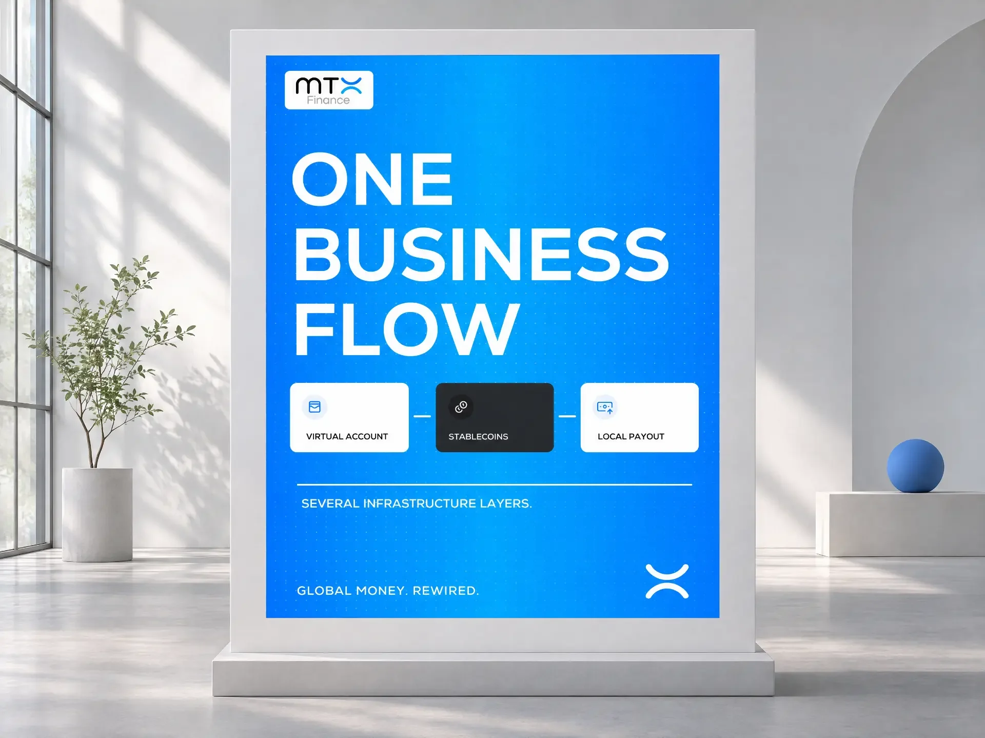
How receipt, conversion and local payout can connect within one infrastructure.
The goal was not simply for MTX to publish more. It was for every post to build positioning.
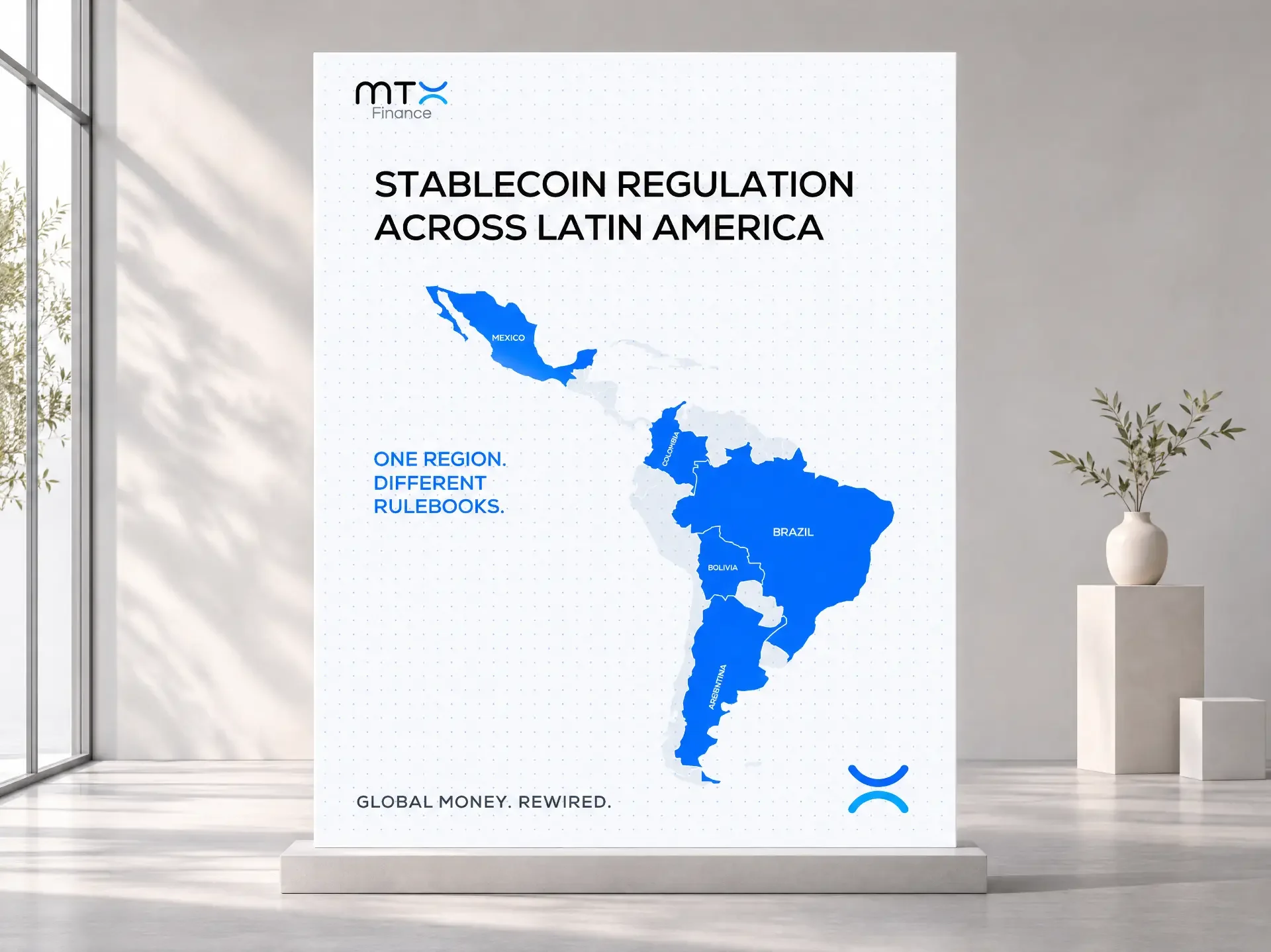
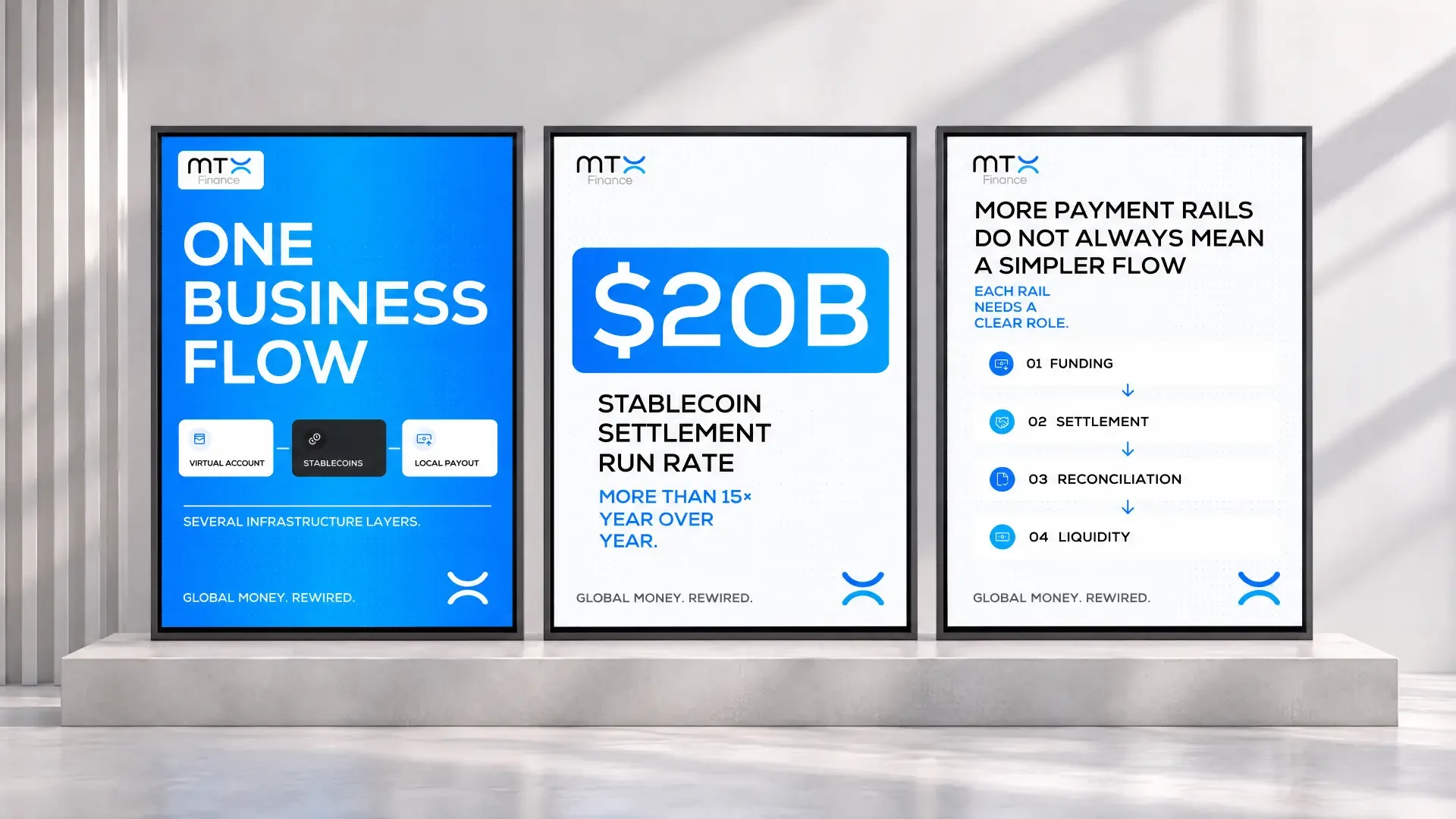
Selected posts from MTX Finance’s LinkedIn communication — from financial infrastructure and virtual IBANs to stablecoins and local payouts.
From the logo to the latest LinkedIn post.
We connected the visual identity, website and social media communication into one system. The website language follows the identity, LinkedIn content follows the same positioning, and visual materials follow the brand system rules.
- the website
- a presentation
- a financial product
- a future touchpoint
One project. Eight connected disciplines.
Logo Redesign
We refined MTX’s visual identity and created an adaptive logo system for different product lines and formats.
Brand Architecture
We built a shared visual logic for MTX Finance, MTX POS and MTX Capital.
Brand Guidelines
We created detailed brandbooks covering logo, colour, typography, iconography, UI and digital applications.
Web Design
We developed a modern visual concept for MTX Finance positioned alongside international fintech companies.
UX & Content Structure
We turned complex services and financial processes into a clear user structure.
Web Development
We built a responsive corporate website with interactive elements, motion and an adaptive experience.
LinkedIn Strategy
We developed a B2B communication strategy focused on real problems and solutions for international businesses.
Content Creation
We created concepts, copywriting and visual direction for LinkedIn posts and campaigns.
From separate communication elements to a complete MTX ecosystem.
The project created much more than a new website or logo. MTX now has a system that can grow with the business: one recognisable visual foundation, three clearly differentiated product lines, a modern digital product and communication that turns complex financial infrastructure into a clear business advantage.
MTX Finance. MTX POS. MTX Capital. One brand built for movement.
MTX Finance project FAQ
What did NewEra do for MTX Finance?
NewEra redesigned the logo, built shared brand architecture and brandbooks for MTX Finance, MTX POS and MTX Capital, created the new MTX Finance website, and developed LinkedIn strategy and content for an international B2B audience.
Which product lines does the MTX brand system unite?
The system unites MTX Finance, MTX POS and MTX Capital. All three share a common visual DNA while retaining their own accents and character.
What do the MTX brandbooks include?
The brandbooks cover logo construction and responsive versions, clear space, minimum sizes, colour, typography, iconography, UI principles, functional states, co-branding and digital applications.
Which services does the new MTX Finance website present?
The website presents multi-currency accounts, pay-ins and payouts, FX, OTC, stablecoins and crypto on/off-ramp solutions as part of one financial infrastructure for internationally operating companies.
How does the website make complex financial processes easier to understand?
The UX uses visual flows, clear product blocks and concise messages. It shows what businesses can do — receive, convert, pay out and move money internationally — without requiring knowledge of the underlying technical infrastructure.
What is the LinkedIn strategy for MTX Finance?
The strategy connects products to real B2B problems through five pillars: business problems and solutions, financial education, product use cases, industry applications and interactive content. Every post follows the problem → business impact → solution structure.
We build brands ready for their next stage.
From identity and digital products to the content a business communicates with every day.
Branding and creative · Website development · LinkedIn and social media · Portfolio · Start a project